NAMORY
Know your Colleagues
This Startup was all about getting to know your colleagues from work or classes, maybe workshops you are attending and so on. The first thing everybody should know about some peer or fellow ist at least their name. That was the focus of this web application. It would have been very helpful for HR Department and onboarding employees to a company since you can use this principle to other questions not only the name of someone.
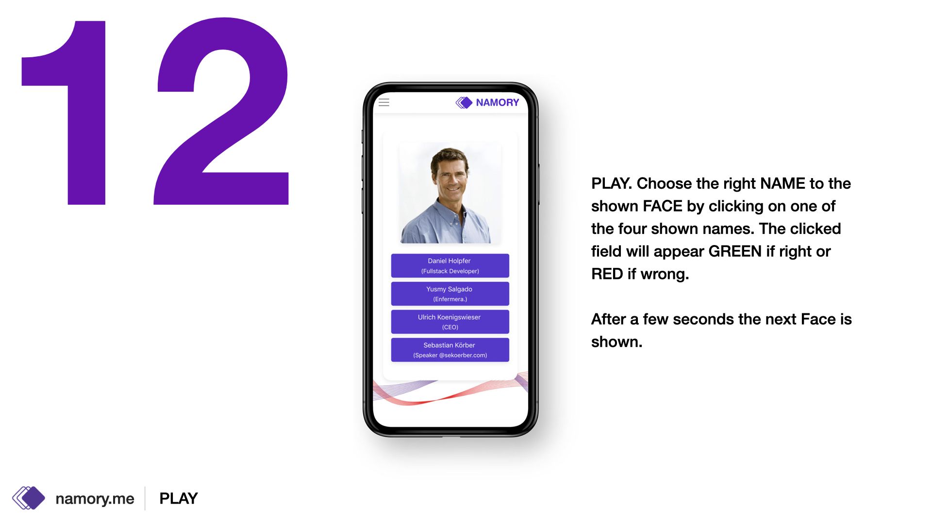
The idea was pretty simple, the user sees a picture of someone and he or she has to guess the name.
FACTBOX
-
Teamsize:
core team: 4
-
Duration:
16 months
-
My Role:
UI/UX Engineer/Designer, Graphic Designer, Frontend Developer (static)
-
Main Technologies:
react JS, next JS, redux JS, Bulma
-
Design Tools:
Sketch, Adobe CC
From scratch
Even if ideas are simple as soon as group management and user roles are involved it gets complicated.
How to get from an idea to a final product? Gather everything.
The first draft was according to the idea that it will be used on desktop only for bigger companies. So I threw every aspect what this web application possibly could offer in a couple of screens. There were no wireframes only some notes. So I thought I could make already a little bit more than wireframes. Even if the design is totally not accurate it provides already some more insights than only wireframes. Especially if involved people are not used to wireframes… some colors, icons and pictures helps. And for me its always good to know if a design-direction is not liked. That means I know in which direction not to go.
It was meant as a white-label solution for companies. Learning your colleagues in a playful manner (gamification).
So the functions were:
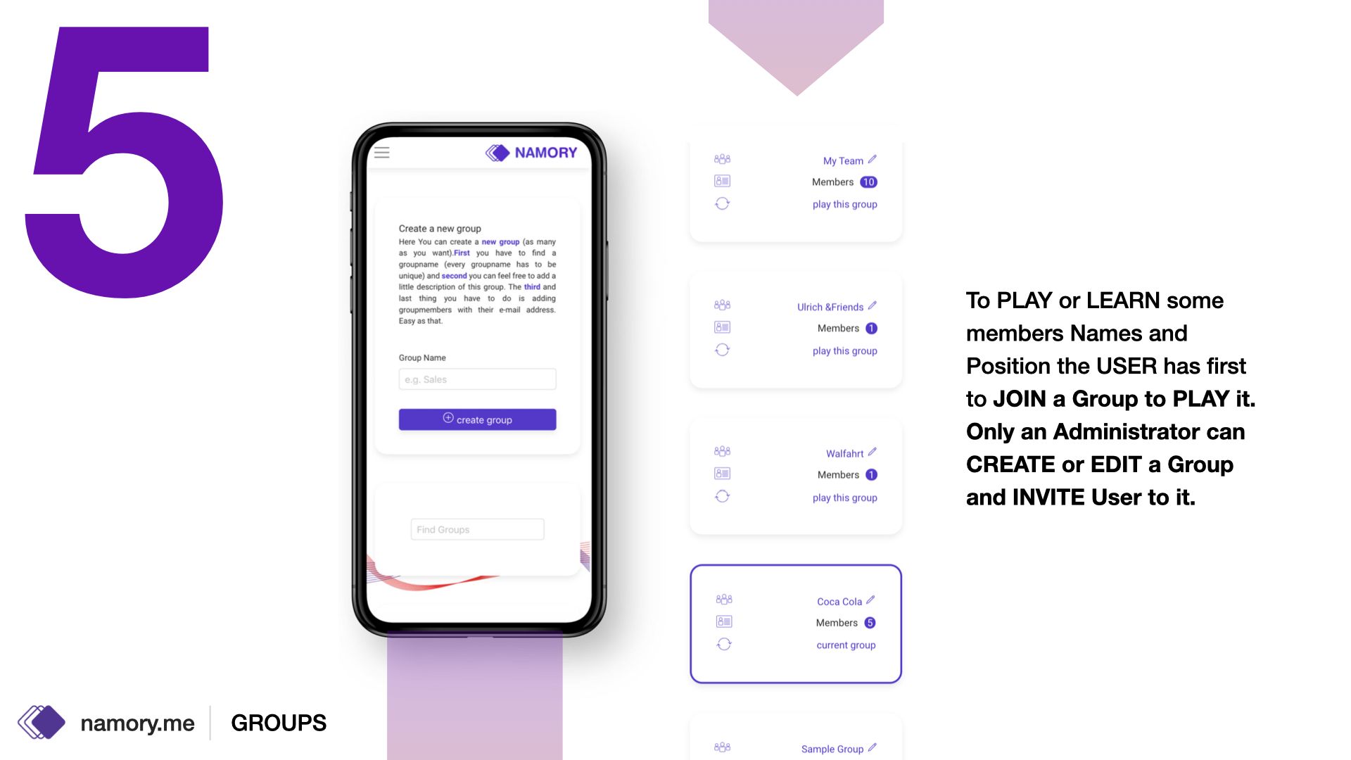
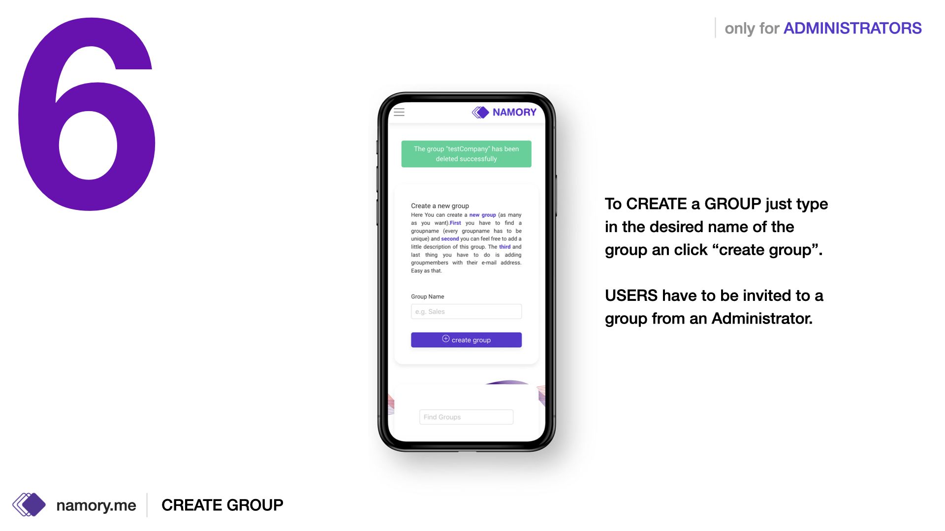
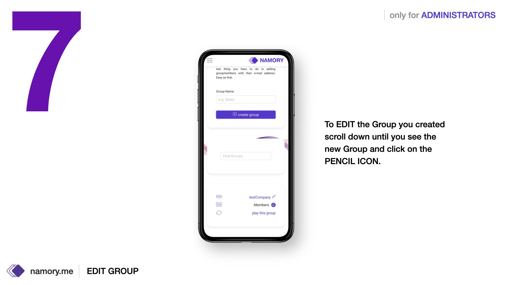
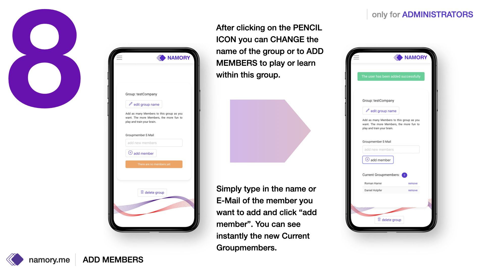
- creating and administrating groups
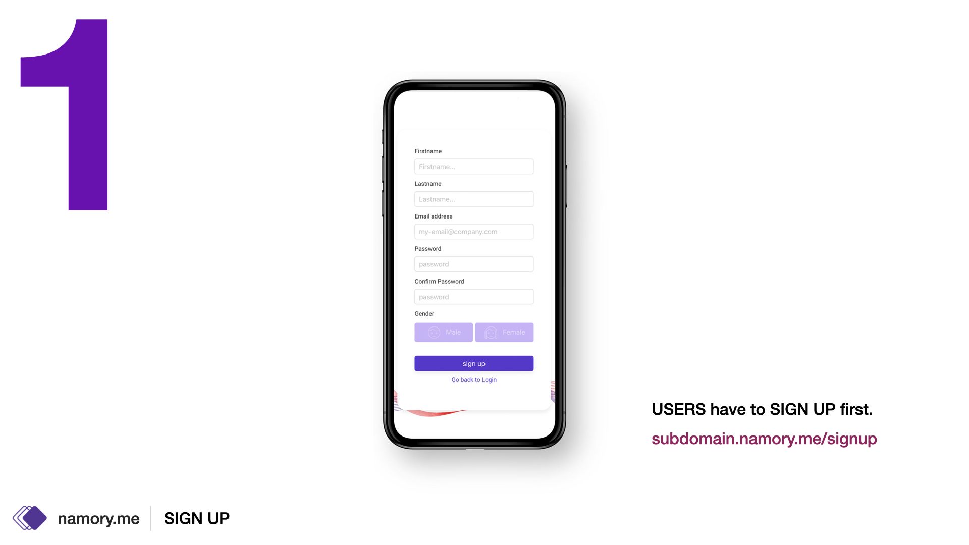
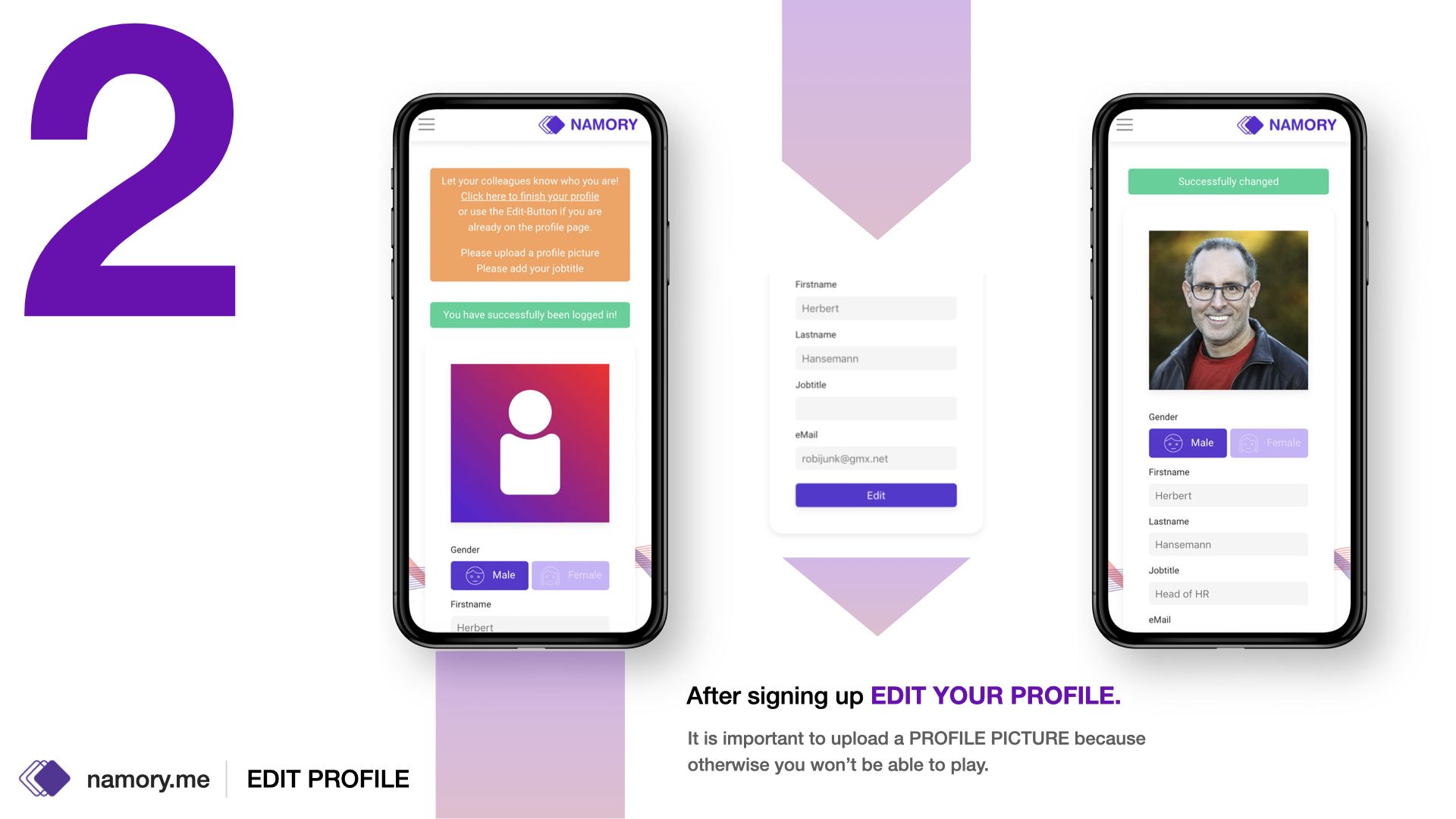
- create and edit your profile
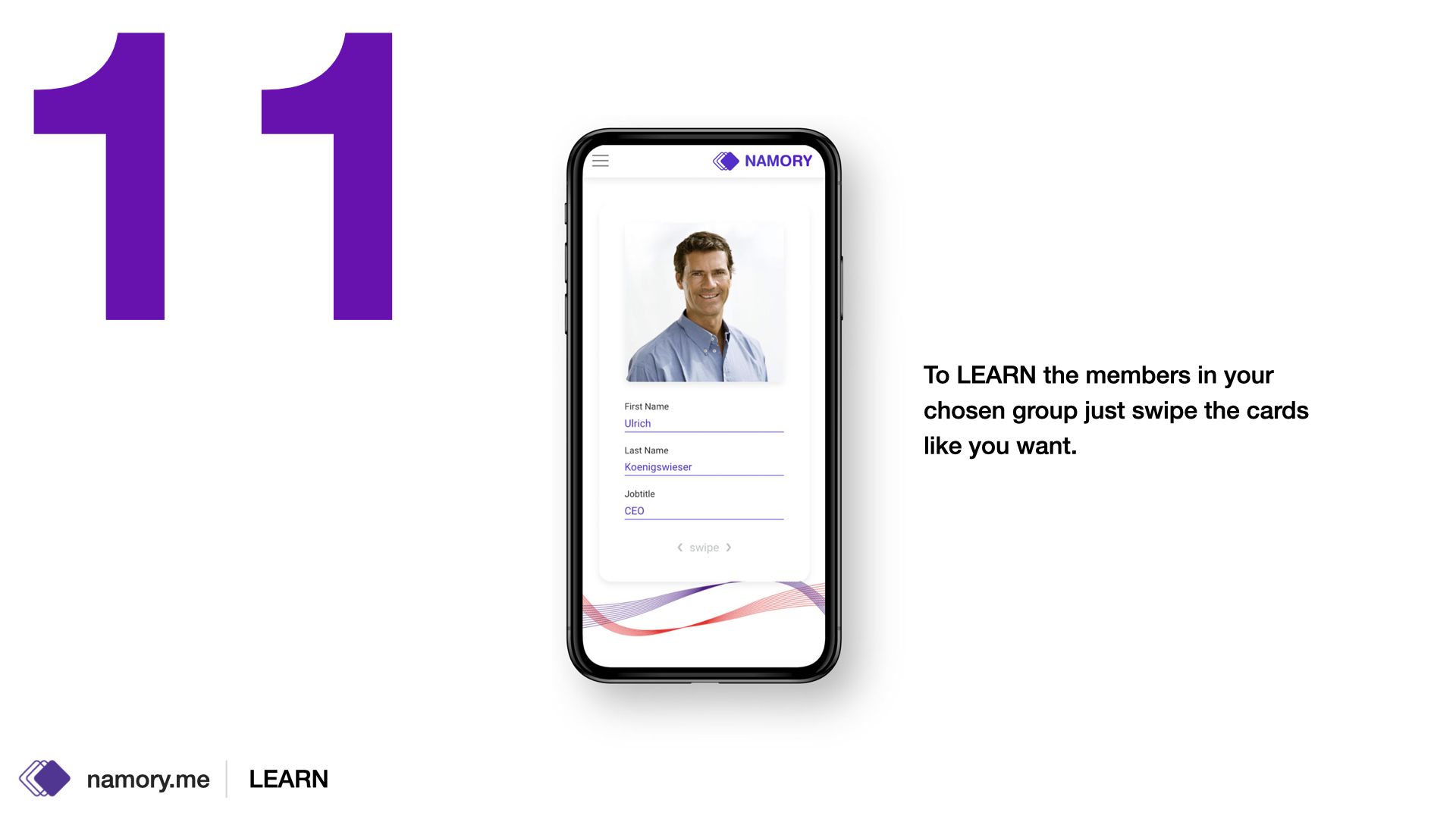
- learn mode
- play mode
Those screens above were the first draft for the desktop version which later on was completely redesigned of course.
The real deal
After knowing how it will gonna be used (no focus anymore on desktop) the real design process started. Now the focus was 90% mobile because the shareholders wanted to see the application more in workshops (outdoor, facilities…) and not necessarily in offices on the premises.
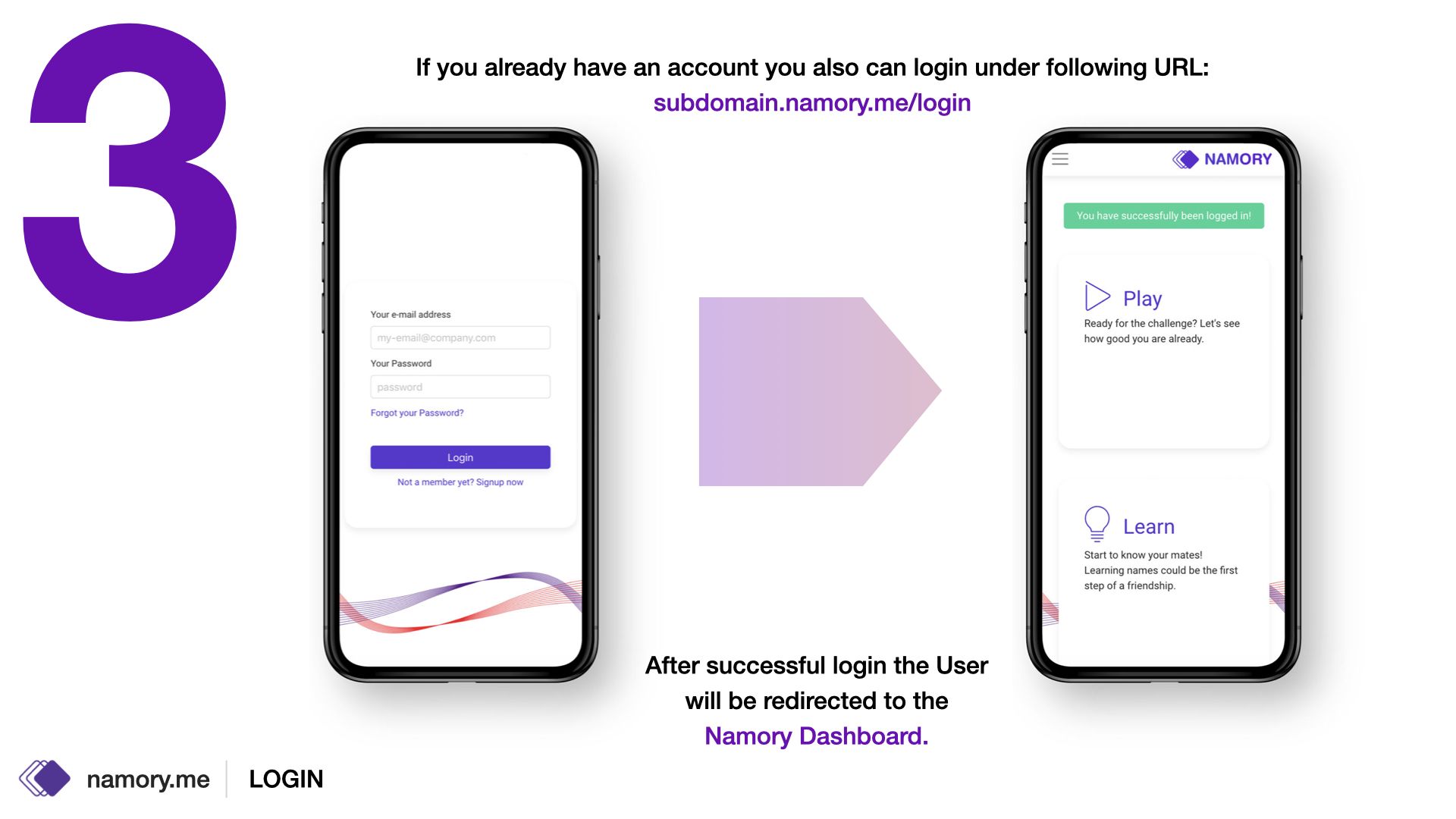
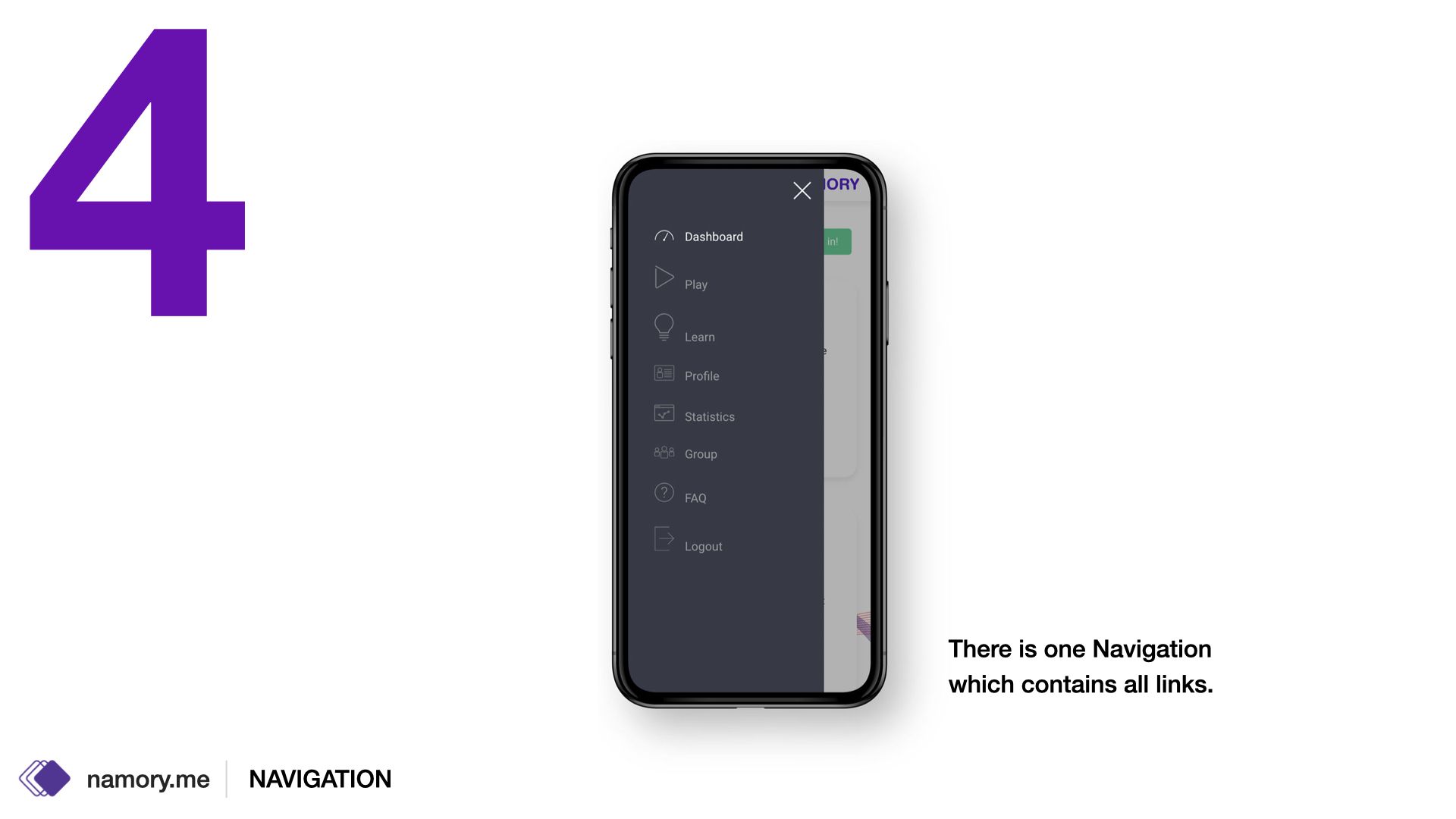
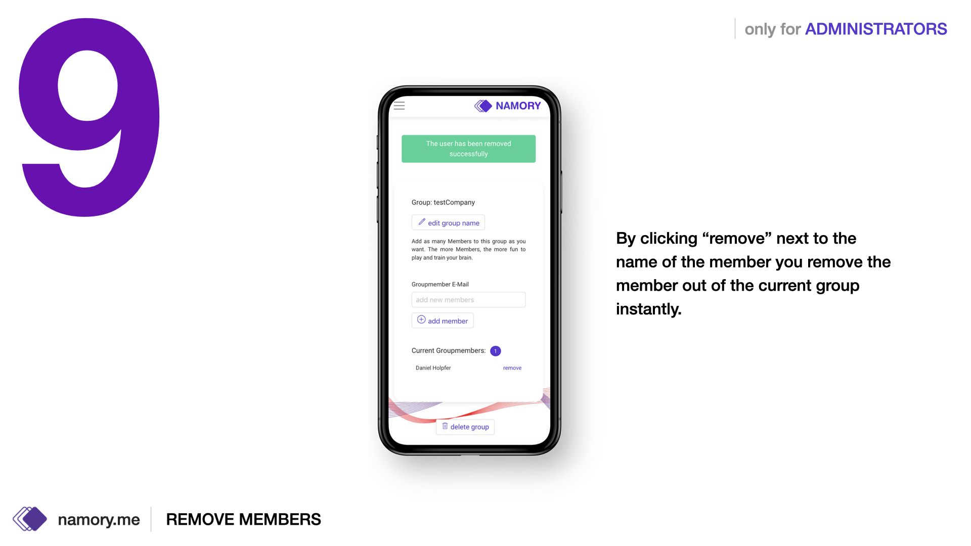
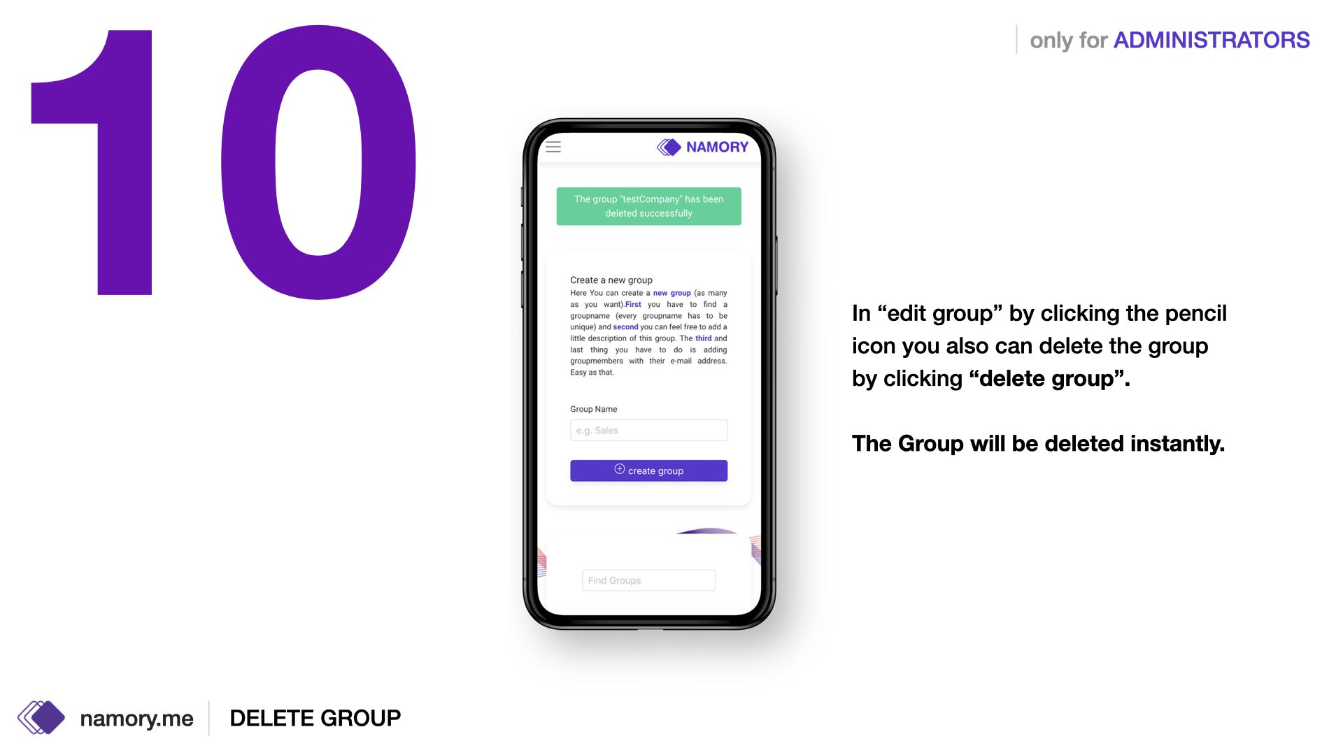
The functionality was the same so it was about the design now:
My Role
Since the team for this project was only 5 people I did of course the design part and also some coding.
The frameworks we used were react.js (frontend) redux.js (the container for the JS App), next.js (server stuff) and the database was powered by mongodb. The CSS we did with bulma.
I am not a JS Developer, so I just helped wherever I can. That means I did some react modules and made the static fronted, but the magical wizzard stuff did a senior JS developer inside our team.
