Cleanvest
Know your funds
Investing money in funds is nothing new at all. But the conscience most people developed nowadays concerning polution, social responsibility and sustainability is something which rose the last years more then ever before. We just have to read the newspaper to see how far it stands about exploitation of ressources (natural or human origin), poverty and climate change.
CLEANVEST wants you to invest your money in CLEAN FUNDS or at least that you are aware of what funds are intertwined or involved in.
FACTBOX
-
Teamsize:
core team: 6
-
Duration:
3 months
-
My Role:
UI/UX Designer, Graphic Designer
-
Design Tools:
FIGMA, Adobe CC (Illustrator only)
A platform where users can get a list (filtering) of available funds to invest with all the background information they need to know if those funds are what they are looking for in the matter of different criteria such as – weapons, atomic energy, protection of species and so on.
The Branding
Since there was nothing concerning appearance, the look and feel, colors or anything but the name I started with the Logo and some icons. The logo should also contain an icon to use for multiple purposes like the favicon in a browser tab. I also created the color scheme in which this entire project should be presented.
My job in this project was all about UX and UI design. I was not involved in any web development or other technical requirements/aspects.


Positive & Negative
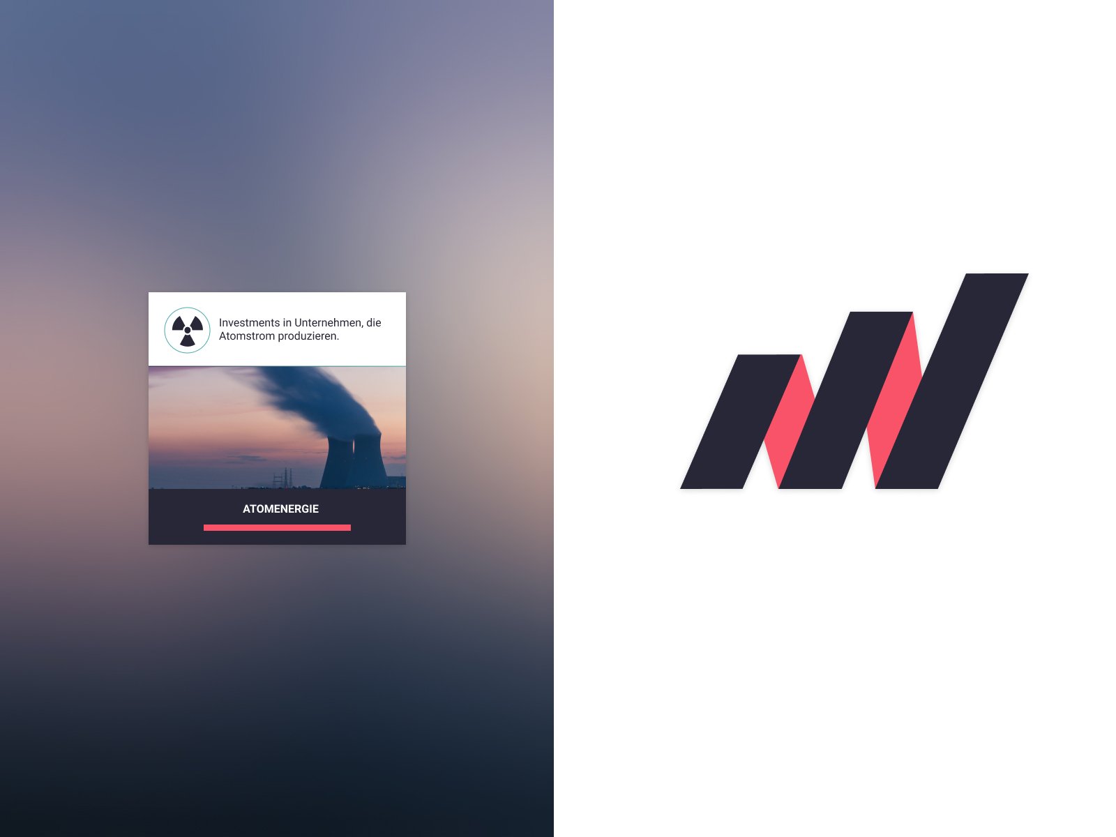
To break things down, which is always my way of approaching a project, we can say that it is about positive and negative facts/criteria a fund is rated.
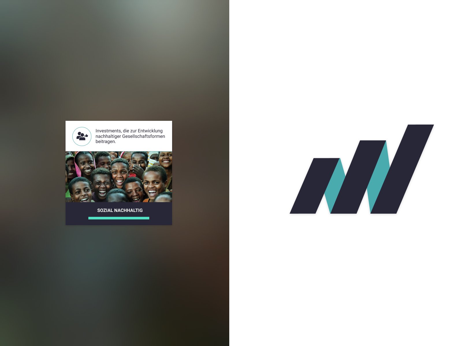
Social sustainability is of course something positive. Positive is green, green is good. It means “go”, no danger, proceed and so on.
High Fidelity first
To show how something can look like at the end – especially if the source were excel sheets – I chose the way of going high fidelity instead of wireframes.
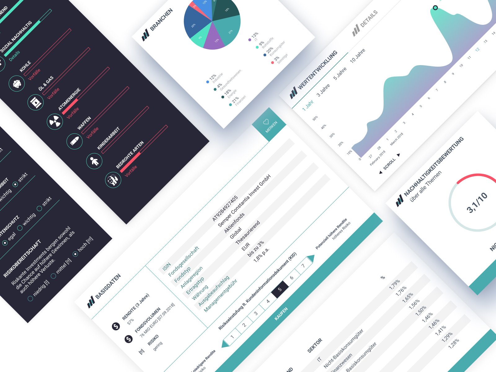
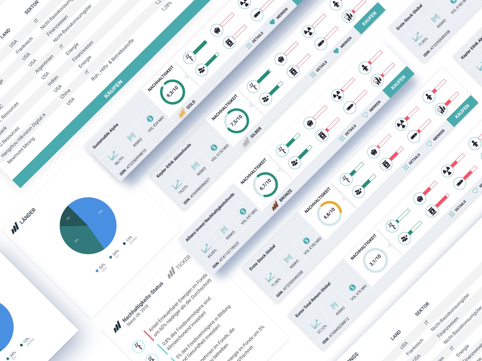
The data I got was only provided in excel tables and coming up with wireframes does not show how you can present data in a user appealing way. So the reason for high fidelity designs was really showing that you can make beautiful styled elements such as cards which provide the same amount of information like an excel sheet but in a much more readable and understandable way. Especially if you are not familiar with this kind of information an excel sheet would not really convince someone to invest in green funds or to transport the message that this topic matters.
With this high fidelity designs of all the information elements I was able to show the stakeholders how you can visualize raw data coming from excel sheets in something most users with no specific funds knowledge will understand.
To have the same effect to stakeholder by showing only wireframes would have been very hard.
