ELOOP
Real Electric Carsharing
ELOOPs new definition of the term “carsharing” is an innovation and something no other company offers so far. Not only that ELOOP only shares electrical vehicles like TESLA M3 or BMW i3 and reduces the carbon footprint of entire cities, they also invented their own token ELOOP ONE based on the ETH Blockchain. That means the more tokens a user have the more shares of the profits the rented cars make the user will get.
In my eyes thats a new definition of CARSHARING.
Environment friendly state of the art electrical cars for a good price and profit shares via blockchain.
My role was to create (design and develop) a user- and administrative friendly website for ELOOP and ELOOP ONE.

FACTBOX
-
Teamsize:
core team: 8
-
Duration:
13 months
-
My Role:
UI/UX Engineer/Designer, WordPress Developer
-
Main Technologies:
WordPress, JS
-
Design Tools:
Figma, Adobe CC
IA – Information Architecture
Since the goal of the website for ELOOP was to provide information and explain the concept of ELOOPs business model it started with collecting all available information. Structure the Information and filter the essential parts to make it more accessible, useful and easier to grasp.
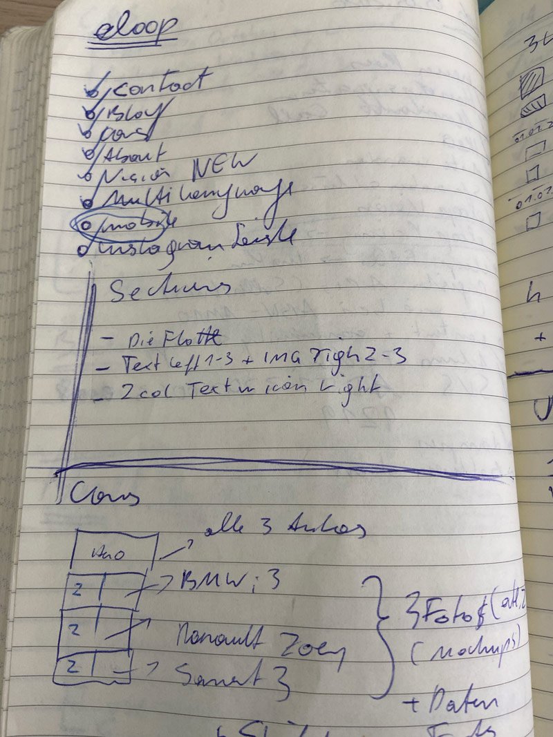
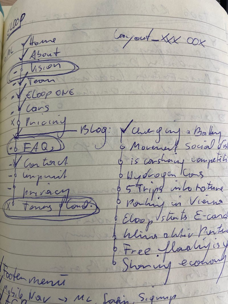
Pen & Paper
Wireframe tools like balsamiq, mockflow, excalidraw and all the others are fine and nice to have but to start you just need a pen and some piece of paper. Starting to structure and highlight all the different pieces of information will help you even to come up already with the navigation layout.
As soon as the important information is filtered you can start to divide it into sections and maybe already come up with helping visuals.
Layouting Sections, define navigations
Dividing and splitting the information in to even smaller chunks helps it even more to make it easier to understand. Users want the information they need fast and easy to access. There is no time for searching a website in regards of the piece of information the user wants. Especially if there are plenty of competitors out there.
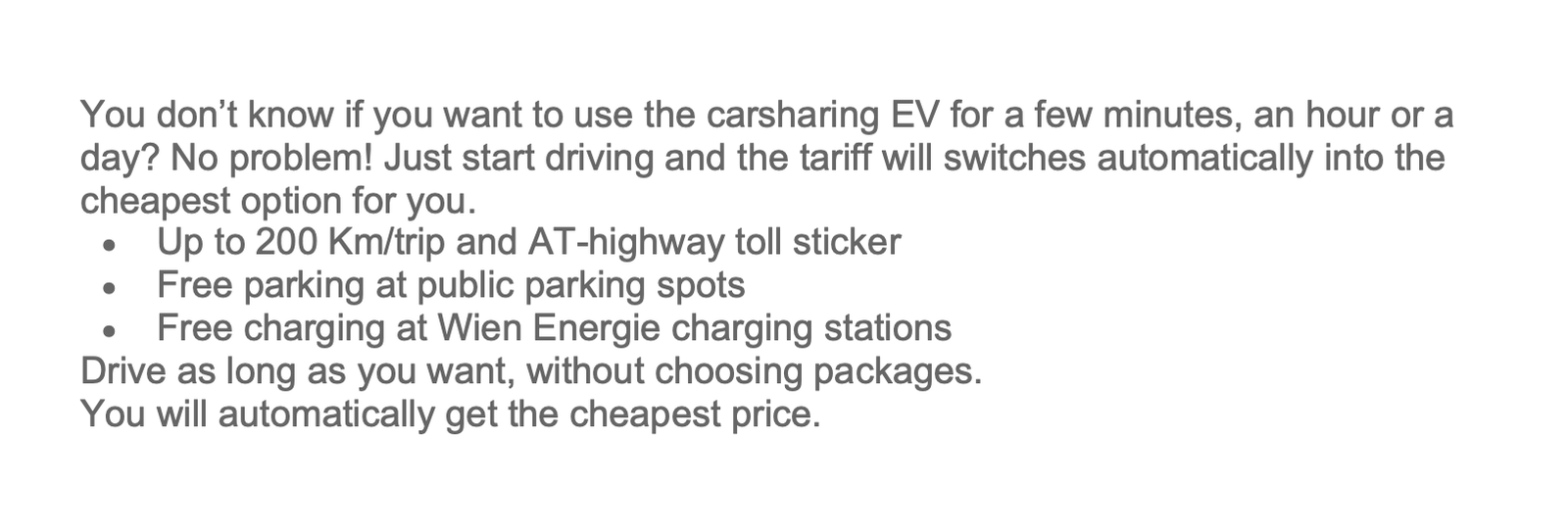
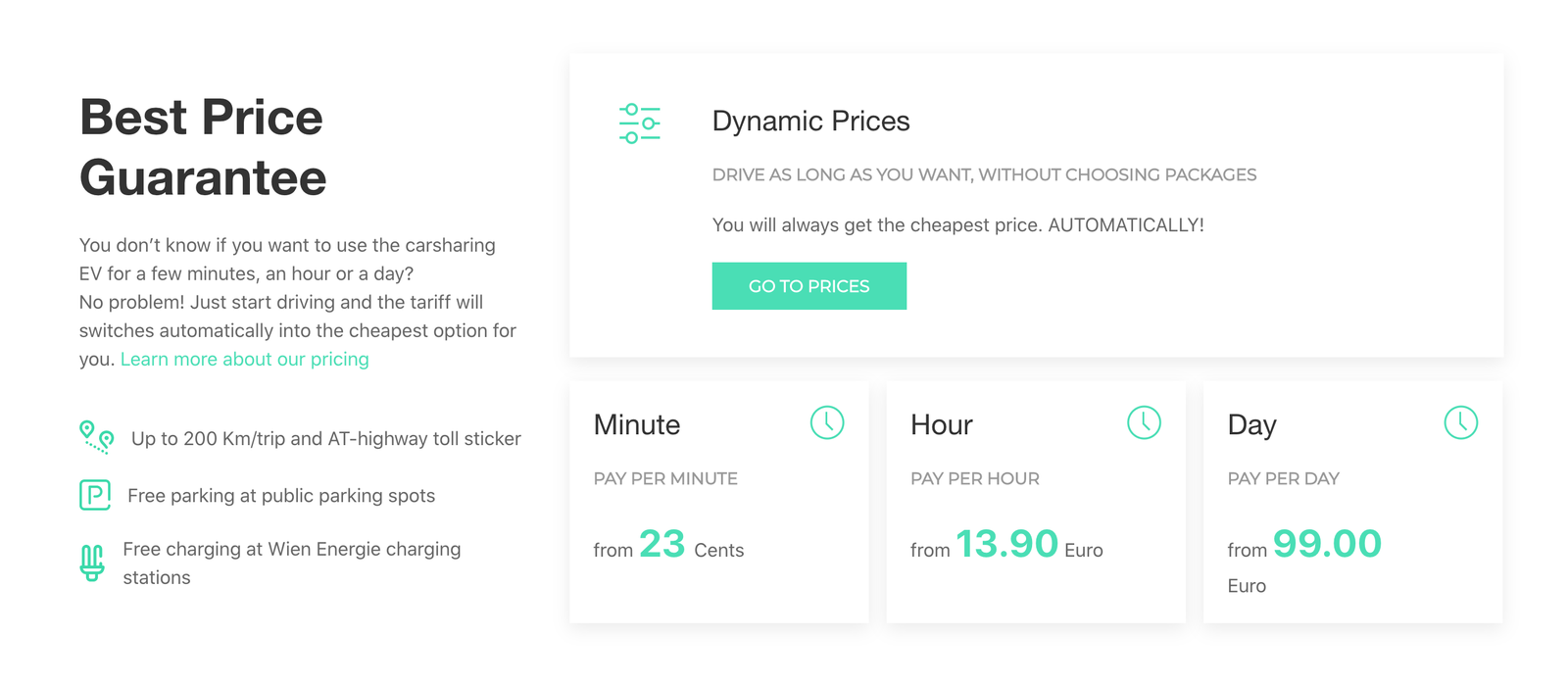
The images above shows the information extraction about the pricing. From the text only version to a high quality design with additional essential information at one glance. Easy to read, nice to see and fast to understand with the possibility to gain more knowledge with defined CTAs (Call To Action).
As crucial as layouting the information is the structure of the primary navigation. This is the part where users want to be lead to the necessary piece of information without the need of thinking. I tend to do this part first when I start a project. It also helps you to see the big picture of a website, an overview of the functionality. Similar to the table of content of a book.
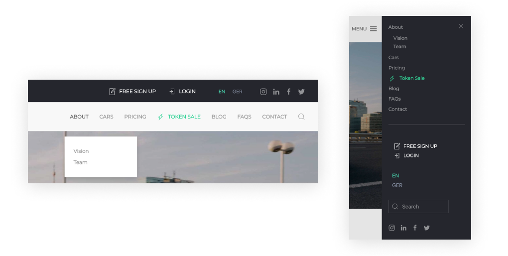
Web Development
Since one of the goal also was to make the website easy to administrate without any knowledge of code so that also people of the marketing department can make changes to it I chose WordPress and for the page builder Yootheme Pro.
I will not explain the advantages and disadvantages of WordPress here since this would kill the scope of the project description. Yootheme Pro on the other hand is something which is not so commonly used (at least at the time I was developing this website). Over the years I gained a lot of experience with the CSS Framework UIKIT and developed plenty of websites or web applications with it. Yootheme Pro comes from the same guys in Germany who developed UIKIT. That helped a lot for choosing this page builder.
A lot of people (especially copywirter and people from with a marketing background) are used to work with WordPress and to teach them how to use Yootheme Pro on top of it was fast forward since they also provide a good documentation.
ELOOP ONE
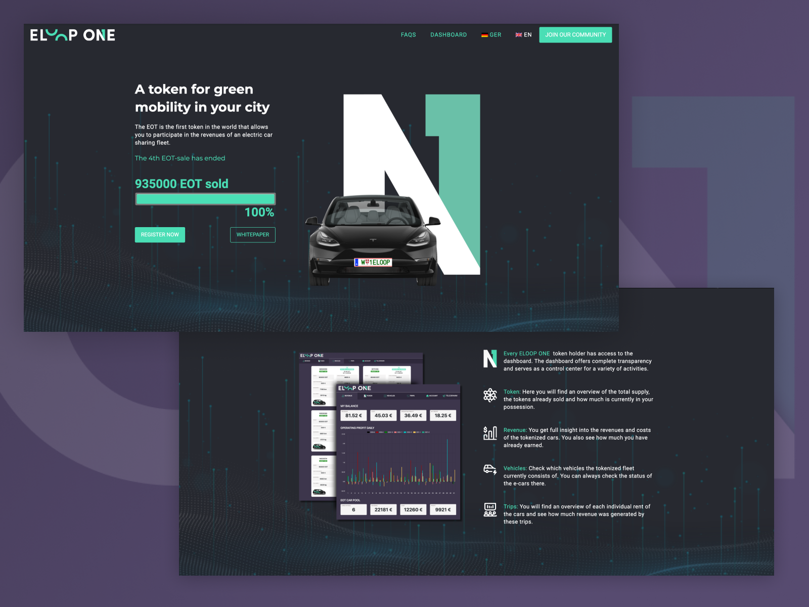
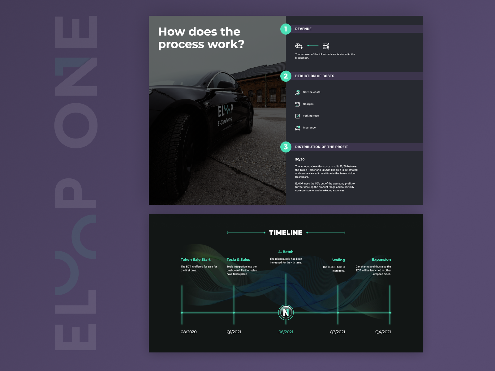
Approaching this website was quite different since the content was already written for presentations ELOOP already had. The explanation of how the token and the blockchain works were already straight forward and my concern was how to make a design for it.
It was about designs and programming the WordPress Theme.
The screendesigns were made in Figma which is very straight forward to work with especially in teams since it is also available in the browser and therefore easy to share with team members.
Same but different
Since the requirements were almost identical with the ELOOP main website in regarding ease of administration of people with no developer background the choice of the CMS was again WordPress. This time though the designs and the flexibility of functionality did not fit to the Yootheme Pro pagebuilder.
The Oxygen page builder is not like all the other page builders out there (such as Elementor, Divi or WP Bakery just to name a few). Oxygen is not even a theme. It comes as a plugin and deactivates the themes completely. You need a little developer knowledge to create templates and it also comes with a steep learning curve. But with my background as a web developer HTML/CSS and also some JS it was the right decision to build this website this way (more flexibility) and make it easy accessible for non developers.


